August 12, 2025
Trend to Try: Color Drenching
As interior design moves away from cool grays and whites and toward more natural tonal whites and colors, you may have heard the term “color drenching” being thrown around by designers. But really, it’s just another way of saying that everything in the room has been painted the same color: the walls, the trim, the cabinetry, even the ceiling.
Lighter colors can be used to brighten a space and make a space looker bigger, while darker colors can be used to create coziness, moodiness and drama. It all depends on your space and the vibe that you’re going for. But either way, here are a few things to consider when you’re considering a color drench.
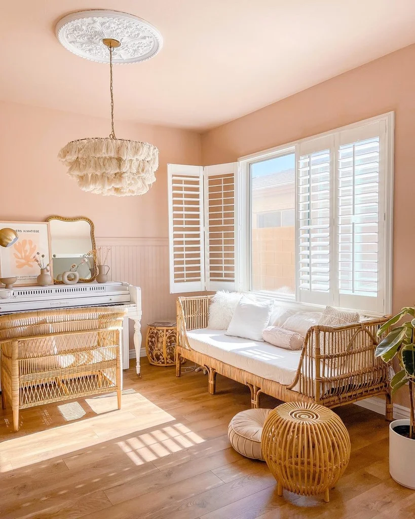
A pink-drenched office space
Lighting
Consider whether your space has lots of windows or needs to be lit by lamps or overhead lights. Lighting—both natural and artificial—will help you determine the finish you need—matte, gloss or a combination—as well as how a color will appear throughout the day and how we perceive it.
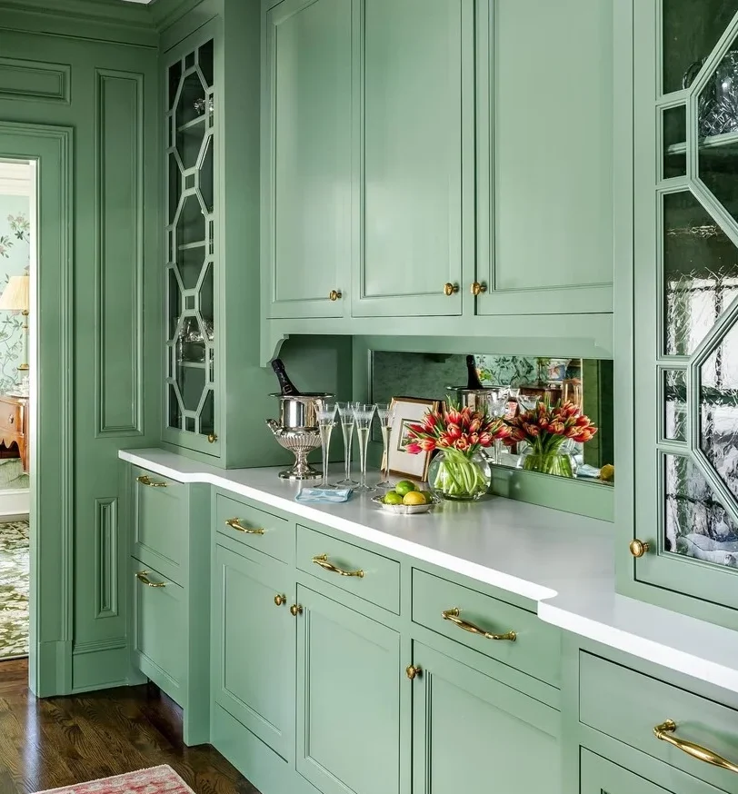
Green paint pops with gold hardware
Furniture
If you’re going for a full monochromatic look, choose a paint color that matches your existing furniture and decor. But remember that a contrasting color can also make your existing pieces pop—think dark green against a brown leather sofa, sapphire blue against gold, or classic black and white.
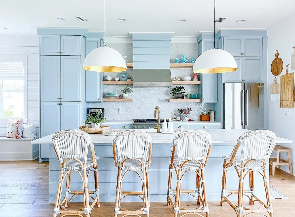
Light, bright and airy in powder blue
Hardware
You can lean into the color-drenched look by choosing a matching hardware scheme or make your cabinetry pop by choosing a contrasting color—think navy blue cabinetry with brass hardware or light green with glass pulls, for example.
Need help determining whether the color-drenching trend is right for your project? Our team is always happy to help. Give us a call at (941) 377-8777.
Beautiful design has the power to transform lives
-Billue Guignard