August 5, 2024
Sherwin-Williams’ 2025 Colormix Forecast Is Here
Sherwin-Williams has dropped its 2025 Colormix forecast, its forecast for next year’s top 48 most trend-forward hues, categorized in four palettes chosen by color experts. The groups of colors are called Chrysalis, Paradox, Wellspring and Kindred. “We’re searching for an authentic color, whether it’s an anchoring dark hue, or a bold, bright pop of color,” Sherwin-Williams color marketing director Sue Wadden recently told ELLE Decor. “We’re not looking to anyone for permission on how we use color anymore.”
Here’s a closer look at each of Sherwin-Williams’ four Colormix palettes.
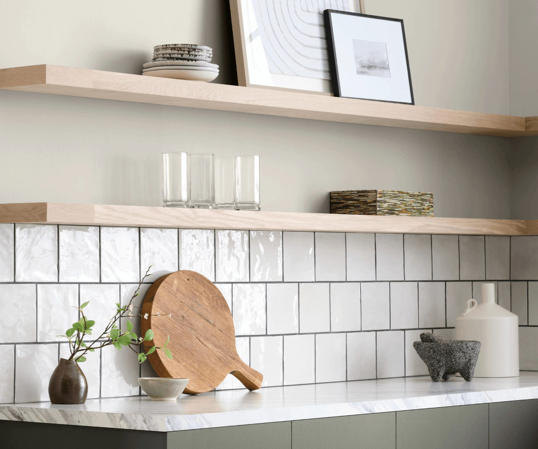
Chrysalis: Rustic, Subtle Neutrals
Sherwin-Williams describes Chrysalis as “a rustic and elemental palette of subtle neutrals that inspires a thoughtful pace of living and propels us to find a touch of poetry in the everyday.” “The colors of Chrysalis are reminiscent of a slow-growing forest, the timeless stories of nature contained within its grain and the generations of precious memories made upon hand-hewn hardwood floors,” says Maggie O’Hare, senior color manager of industrial wood coatings.
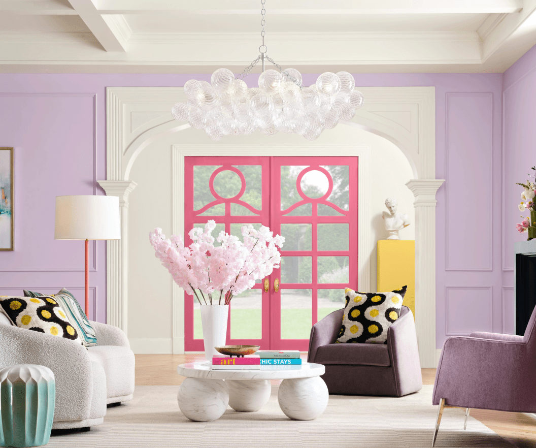
Paradox: Bold Brights
This palette is all about dopamine decor: bright blues, candy-colored accents, and energetic deep greens and blues that connect are all about self-expression. In other words: these are in-your-face colors. “Unexpected elements in print, pattern and perspective ignite the interest of an interior and push the boundaries of inventiveness to establish surreal engagement in both residential and commercial design,” says Kiki Redhead, Sherwin-Williams’ global CMF and trend manager of industrial and performance coatings.
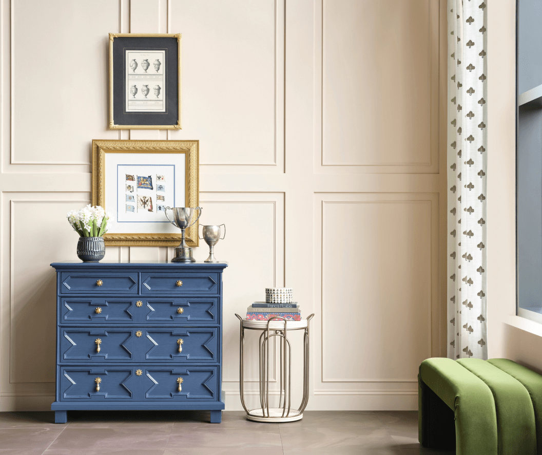
Wellspring: Warm Neutrals and Muted Jewel Tones
With this palette, the Sherwin-Williams team asks us to “embrace a mindset of openness and belonging” with a collection of warm neutrals, comforting deep tones, and warm-hearted hues that nurture and nourish. (Think: quiet luxury.) “Wellspring’s notion of authenticity extends beyond the tangible to encompass the entire creative process, from conception to realization, advocating for preservation, repair and reuse over replacement,” says Colormix Trendsight team member Patricia Fecci.
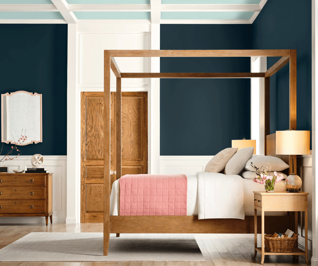
Kindred: Warm, Mature Brights
Per Sherwin-Williams, Kindred is a palette that defies expectations: electric brights, grounding neutrals, and candy-coated accents—think of this capsule as Paradox’s grown-up older sister. “Through thoughtful architectural and interior design and by prioritizing user experience and engagement, design teams cultivate environments that not only meet functional needs, but also instill a sense of pride and ownership among community members,” explains Emily Kantz, color marketing manager of Sherwin Williams’ global architecture group.
Which palette is your favorite?
Beautiful design has the power to transform lives
-Billue Guignard